Some time ago, a woman asked if I could do a color consult on a custom house she was building. She asked to meet me in my home to “better understand my taste.” When she stepped over my threshold, she said, “Oh my, this is a lot of color.”
I already knew how this would play out.
She told me she was looking for an authority on color, one who understood how to impart mood. “Ah,” I replied.
She continued: “I want a neutral color scheme to reflect us as a family, you know, sophisticated. Cool colors only—just different shades of beige. “
Oh no, I thought.
Obviously I never saw the inside of that house.
I have nothing against beige. I find it vexing that Jane Goodall, who shared my skin tone, rocked beige. Maybe it was her mien. Anyway, beige makes me look like a ghost figure in the background of a washed-out vintage photo. I avoid wearing it unless I can balance it with a color that makes me pop.
Neutral Zone
Most people think of neutrals as colors between black, white, and brown— colors not visible on the color wheel. And somewhere along the way, the color “griege” came into being, a word I don’t relish. White, black, and the grays springing from them are neutrals. There are variations of orange hues on the outside perimeter of the color wheel that lean towards brown, but the browns that come from mixing two complementary colors are not on the wheel. Mix them with white and gray, and you get beige.
Then there are the near-neutrals. Simply put, variations of near-neutral shades are saturated colors lightened up with gray or white, or darkened with gray or black. You can also arrive at a near-neutral by using subdued colors that already have white in them, like Naples yellow or a petal pink. You’ve already learned that hue saturation declines when a pure pigment is mixed with another color. The same is true of near-neutrals. In our prompts, we’ve already been edging towards neutral territory, so you’re getting there on your own.
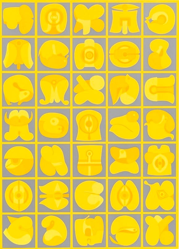
Neutrals are important. They give the eye a chance to rest, to recharge. Designers and artists use neutrals with saturated color to keep the eye moving and a space or composition vibrant, like the stunning use of gray and yellow in Takeshi Kawashima's painting in the lead photo above.
American culture currently defaults to neutrals because they allegedly convey sophistication, calm, and hipness. If you use too much color, you are showing emotional flamboyance. Neutrals are also associated with wealth and status. My artist friend Jody and I dubbed the local interior design preference of our prosperous valley “default beige.” I get it, choosing neutrals is a safe way to bypass the color labyrinth.
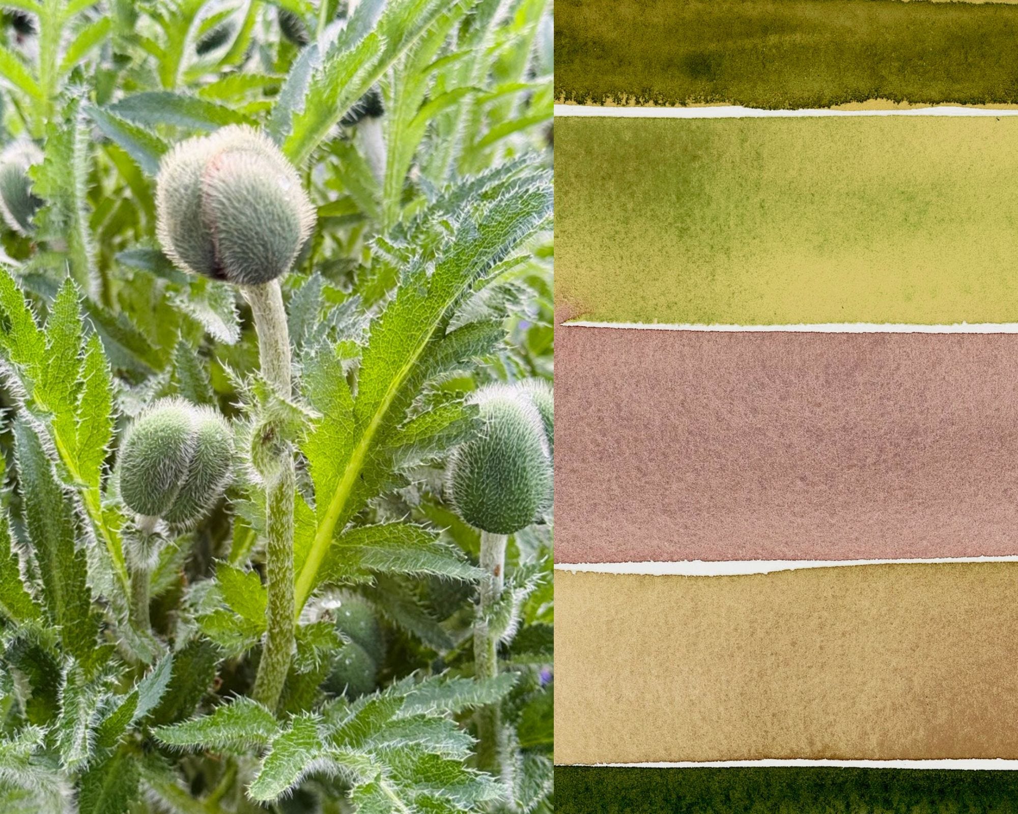
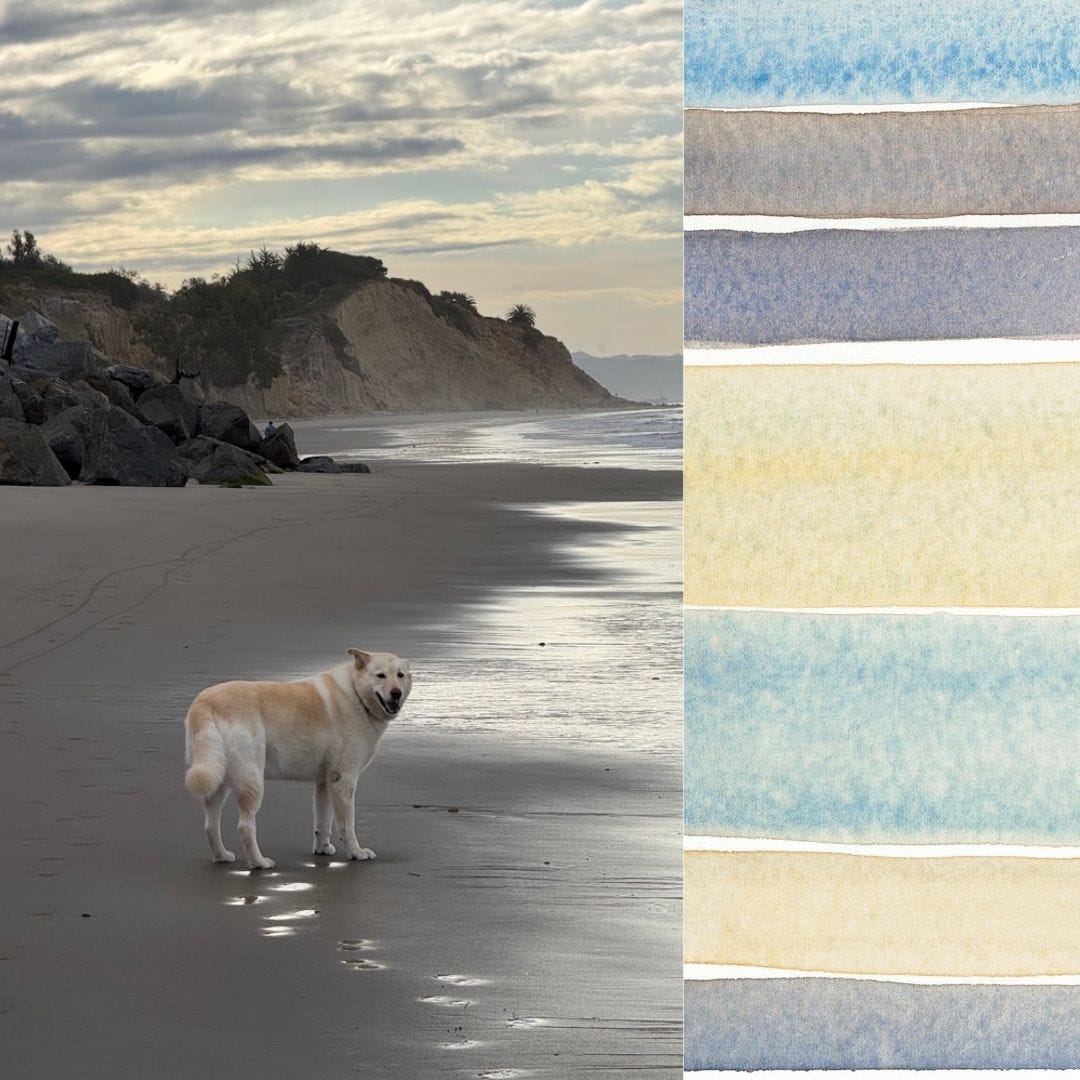
But understanding the relationship of color to neutrals is important for color fluency. If you look outside, it’s easy to spot how neutrals and near-neutrals work in tandem with saturated color.