Hue, Value and Saturation
Color 2.0

For those in my class, we are halfway through Living in Color. Wait, what? Teaching again has forced me to brush up on some skills and develop others, like putting together video prompts that don’t prattle on. It’s also had an unexpected benefit. Your enthusiasm has helped me through a challenging milestone, another year without my daughter. So thank you.
For the rest of you, feel free to leapfrog past this post and look for my usual bi-monthly essay next week. Or, think about joining us to learn about color. The more you build your color vocabulary, the longer you’ll linger in museums, farmers’ markets, or gardens. The patterns of the natural world will pop and you’ll slow down to look more closely. This will invariably annoy someone in your family, but they soon learn to wait for you in a café.
The great thing about an online class is that you can do it at your convenience. And feel free to skip ahead to the video prompt.
And now we’re ready for the next rung up. This is a shorter read than the last post, but the prompt may take longer.
Knowing about hue, value and saturation may not make you dazzling at cocktail parties, but these fundamentals will improve your color fluency. Let’s start with hue.
Hue
Many people think that hue is a fancy pants way of saying color. But of course, this is color theory, so it’s not that straightforward. Color is an umbrella term, while hue is more specific. Hue refers to the purity of color on the spectrum, or specifically the governing wavelength of visible light. If you look at the primary and secondary colors on the color wheel, you can pluck out the purest hues. Tertiary colors are excluded because they combine all primaries in different proportions, thus diluting their purity of hue. But we still love and need you tertiaries — you’re just a bit more introverted! When you add white and black to a hue, its purity subsequently diminishes.
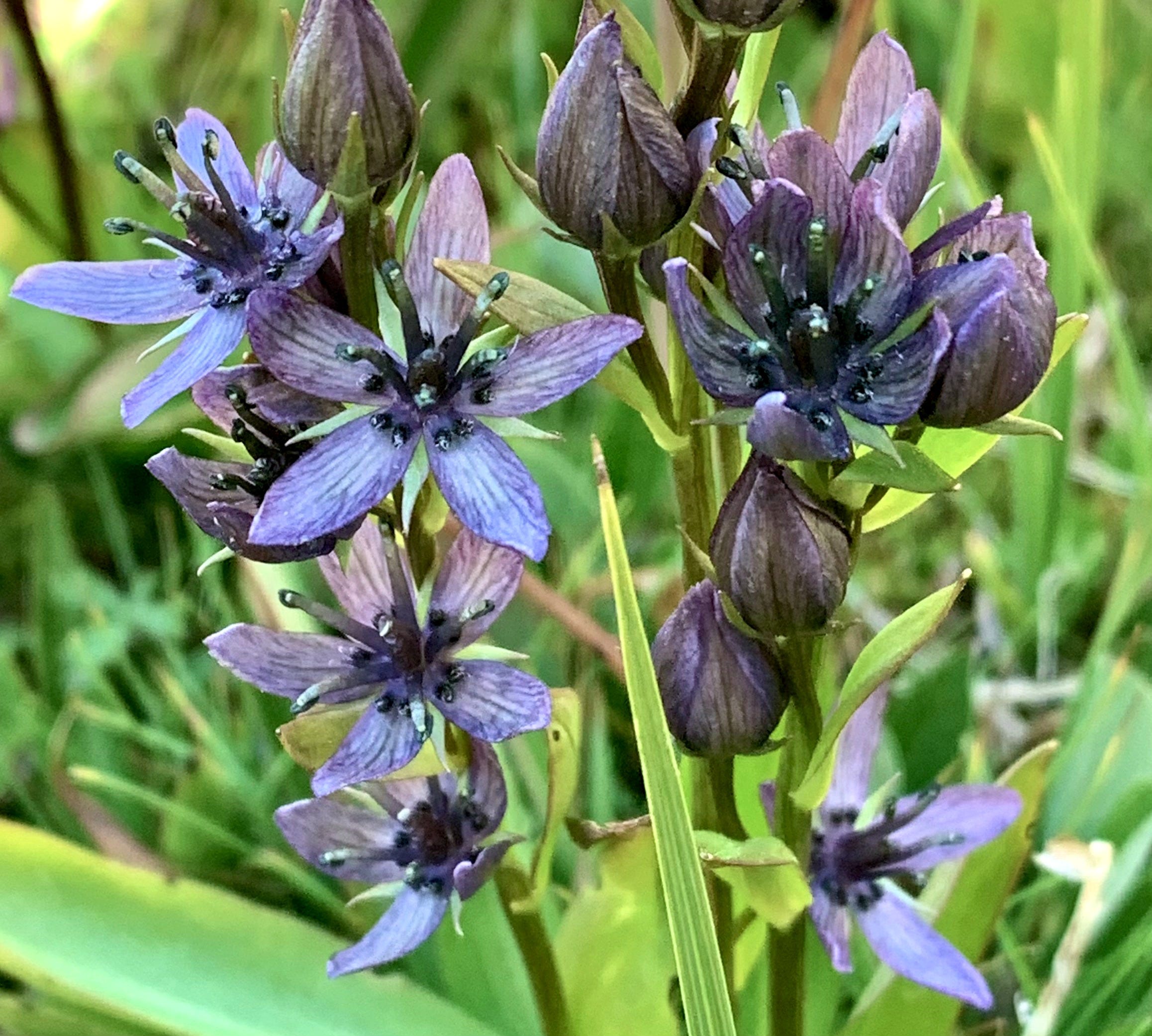
Most of us know that Sir Isaac Newton had his eureka moment when he discovered that color is a characteristic of light, but if you want to learn more about the science of light, here’s a good overview. And in case you needed some good nickel knowledge, violet has the shortest wavelength on the spectrum —perhaps that’s why I love the elusive star gentian pictured above. Red has the longest wavelength, which may explain why it’s frequently appropriated to underscore social and political messages. For example, red is the most common color in national flags.
Saturation


If you ever edit photos on your smartphone or computer, you can fiddle with saturation by adjusting the percentage. Slide one way, and the colors look garish—the other way, the colors are washed out. This is a simple way to understand saturation. Colors that are fully saturated are not cut with black or white. Pastels may seem more “timid” because the color saturation is diminished with white. Experienced designers and artists understand how to use this aspect of color theory to set psychological tone. For example, my husband and I recently watched a TV show called Dark Winds set in the Navajo Nation. The cinematographer saturates the Navajo culture with color. But when the Navajo intersect with the world outside the reservation, the colors are much more subdued and the sets have a film noir vibe. Point taken.


Once you grasp the one-two punch of hue purity and color saturation, you can appreciate how these principles are employed to shift your eye and focus. My friend Julie is a quilter, a master at interiors, and like me, loves color and patterns. She uses saturated colors liberally in her home but takes care to use white walls to give the eye a place to rest. This way, she can connect colors like a series of notes, keeping the viewer engaged but never overwhelmed. A couple of years ago, I ran a design studio. I wore this orange vest for a magazine shoot to make me stand out, then staged the studio around that orange to suggest that I might even know a thing or two about color.
Value
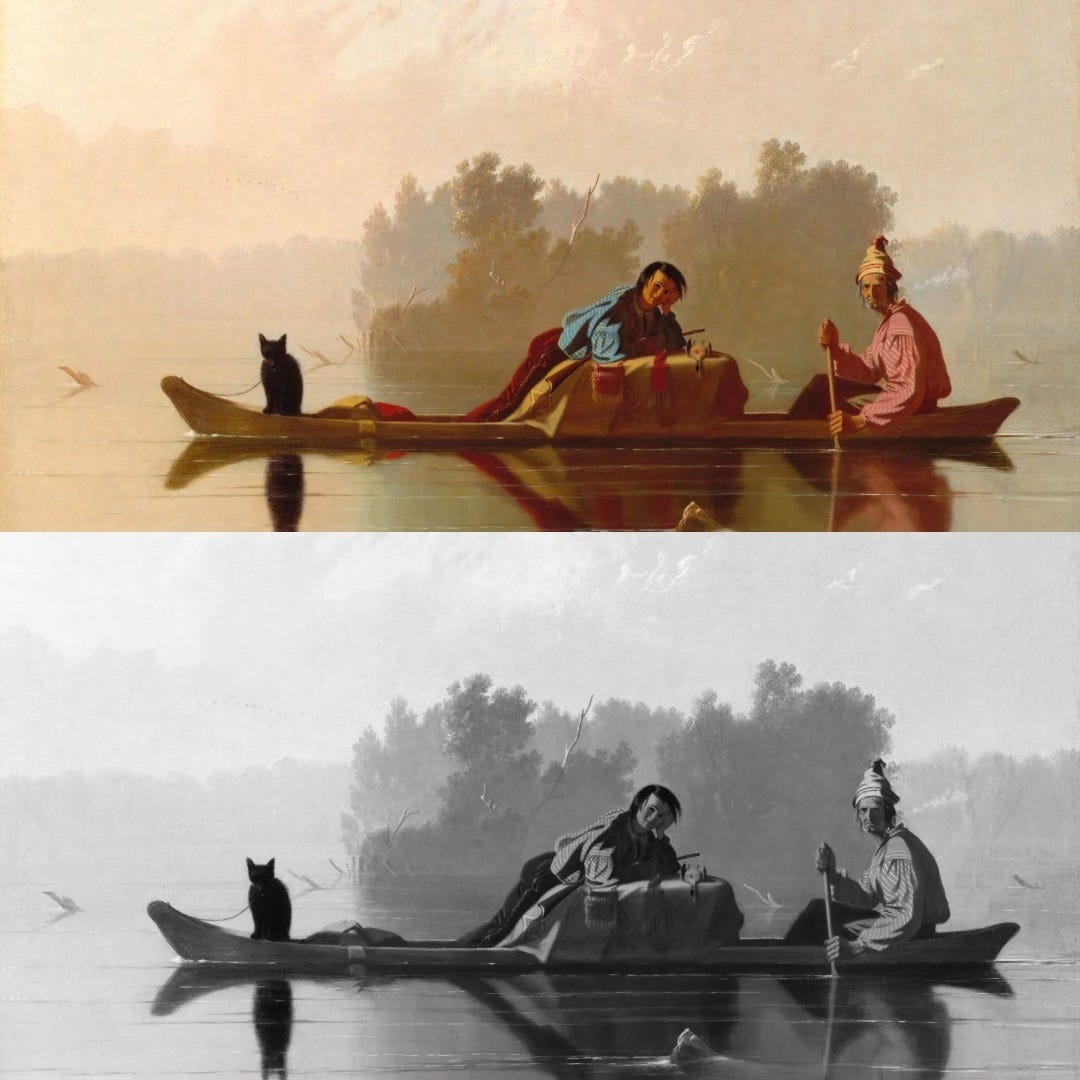
Value is the lightness or darkness of a color. Very light colors have high value, while dark colors have low value. Most art students learn that light colors come forward and dark colors recede. Your iPhone can help you understand this concept as well. Set any colorful photo to gray scale, and you can gauge the values. Artists use value to set the mood, sculpt the composition by giving it depth, or give a painting a more narrative feel. George Caleb Bingham’s iconic 1845 painting in the Metropolitan Museum of Art is a good example of the power of value. Once stripped of color, the values are easy to identify.
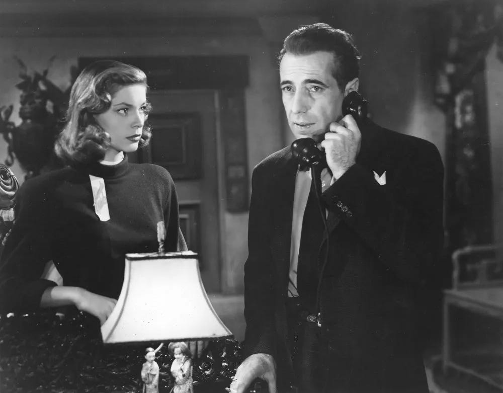
This still from The Big Sleep demonstrates how value also amplifies drama. Bogart is a can-do guy, so he’s lit head on and comes forward, while Bacall is lit with lower values, half shadowed, more inscrutable, but still beyond luminous.