

Color Blind
what shapes our relationship to color?

Hello readers! This is the last of four essays on color from my Living in Color class, so thank you for joining me. I am off to celebrate my 25th wedding anniversary and will return in a month.
For five years, I was the founder and creative director of an art and design business. The studio showroom was open by appointment, and visitors came in to browse art, textiles, and paper goods. With every visit, I fielded questions about color. I noticed how ‘brighter’ colors made many women — the majority of my visitors — flat-out anxious. Women didn’t want to draw attention to themselves or were nervous that they’d get the colors wrong or that certain hues wouldn’t match their style/skin/makeup.
Fair enough. A collective anxiety over color has spawned huge industries pitching foolproof methods at a steep cost to assign colors to your mood, skin tone, and age. I remember the seasonal color trend in the eighties — you were assigned to “your” colors according to the Spring, Summer, Fall, and Winter. I have no idea what I was, but my sister had hers done. She was jewel tones, a Fall. There are even more pre-ordained palettes to suit your wardrobe and your house to steer you clear of color bloopers.
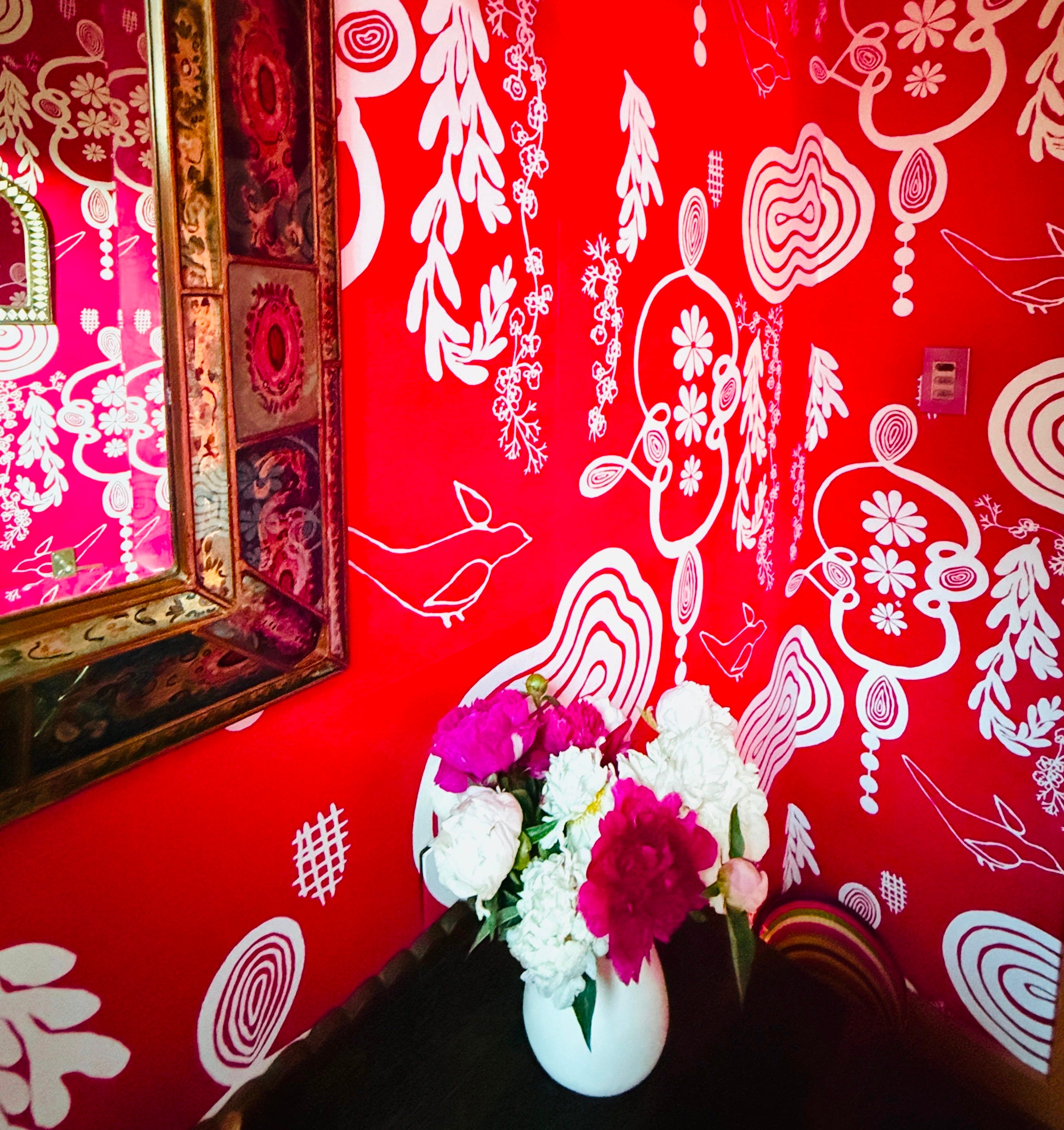
Colorful interiors also give people pause. I have a pink bathroom. One visitor fell in love with the pink exuberance in my stamp-size loo but told me she couldn’t possibly wallpaper her bathroom in neon pink. When I asked her why, she simply responded: "Because my interior designer wouldn’t approve. It’s just too out there. She thinks bright colors are vulgar, so we limited the color palette to three neutrals, with exceptions for some artwork.”
We too often make decisions based on what other people think, and color choice is no exception.
I used to think that geography and childhood environment determined color preferences. Southern studio visitors favored bright colors, as did those from Latin American countries, while those from New England and California preferred neutrals. But when I started researching chromophobia (a real word and legitimate phobia ), I stumbled onto another explanation for our color preferences. The writer Carolyn Purnell explores the historical context of color in Color, Chromophobia, and Colonialism: Some Historical Thoughts:
“In England, contemporaries often called Indian textiles “rags” or “trash” and scorned their bright colors, and in Europe more generally, bright colors were taken as a sign of degeneracy and inferiority. The German writer Goethe famously stated that “Men in a state of nature, uncivilized nations and children, have a great fondness for colors in their utmost brightness,” whereas “people of refinement’‘ avoid vivid colors (or what he called “pathological colors”). In short, a love of bright color marked one as mercurial, uncivilized, as not possessing taste, as being foreign or other. Color represented the “mythical savage state out of which civilization, the nobility of the human spirit, slowly, heroically, has lifted itself — but back into which it could always slide”.
I know my chromophilia (yes, that’s a word too) stems from living in a Central American country when I was young and absorbing the Latin celebration of color and pattern. My Texan mother loved color and painted many of her ceilings blue to ward off evil spirits, an alleged Arab custom brought over with slaves, but she still shied away from the saturated reds and pinks.


Each individual color is a universe in itself. JOHANNES ITTEN
David Batchelor’s book Chromophobia goes deeper, suggesting that our skittishness around color suggests a desire to be “scraped clean, cleared of any evidence of the grotesque embarrassments of an actual life. No smells, no noises, no colour; no changing from one state to another and the uncertainty that comes with it.”
Personally, I think Batchelor is a tad extreme, but there is no doubt that we associate desaturated color with control, calm, or sophistication.
The Final Prompt
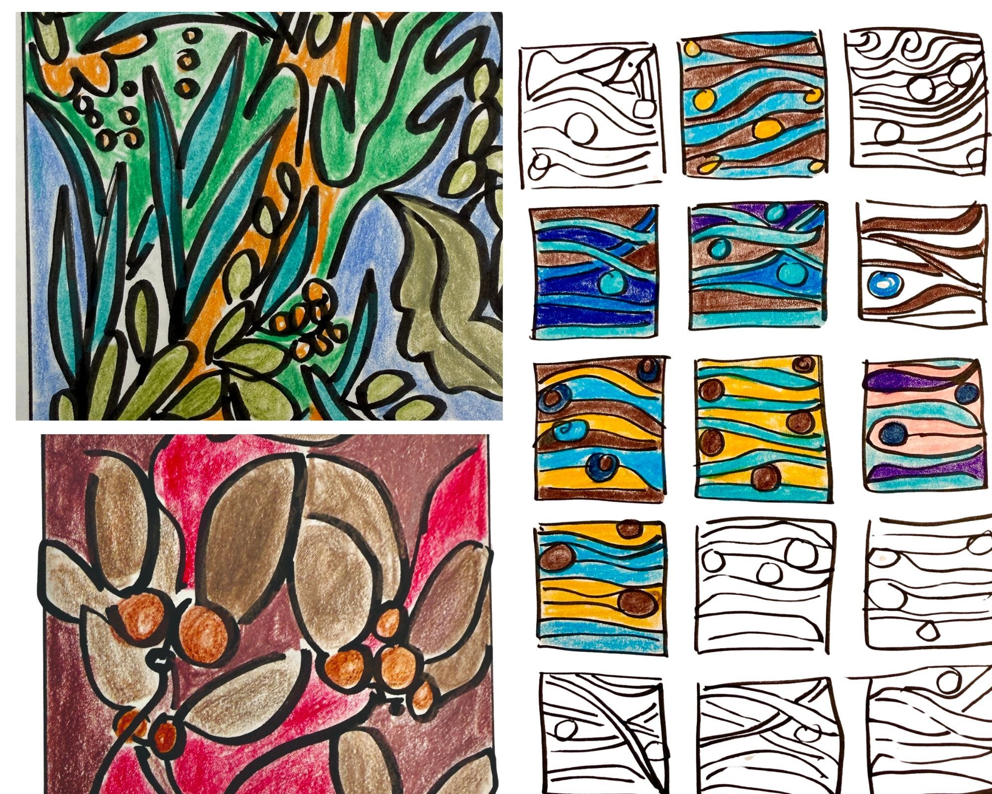
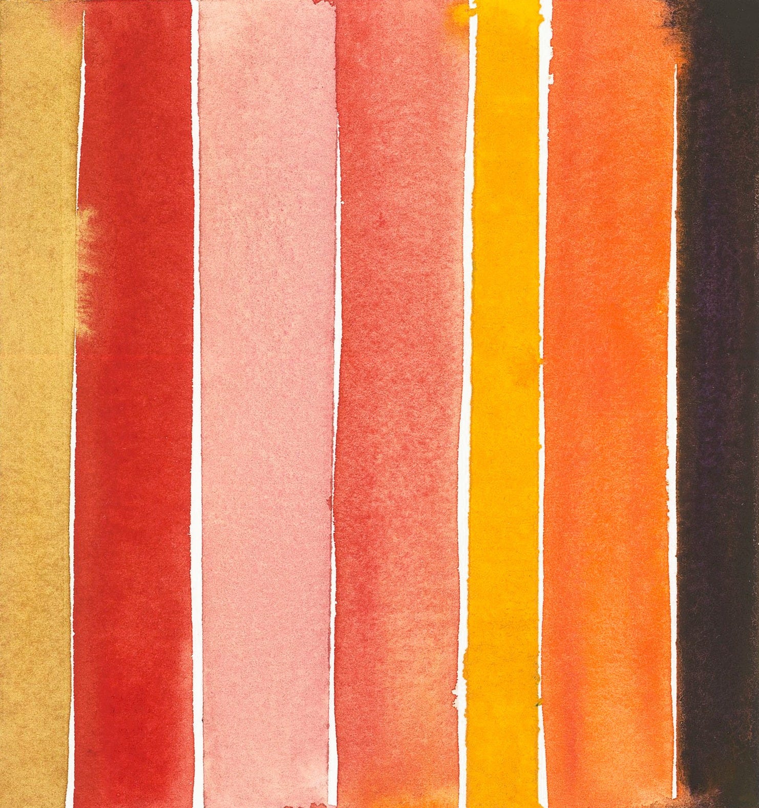
My journals are filled with thumbnail drawings of place and color. When my kids were little, I’d play a game with them whenever we were on the road to pass the time. They’d select three or four colors without looking out of my colored pencil pouch and fill in whatever doodle I made — or they made. I still play that game, but also choose three or four colors that are definitely outside my comfort zone and knowledge of color theory. There have been many surprise pairings, and this simple exercise has contributed to my understanding of color.
For today, make an abstracted sketch as in the video below. Abstract drawings remove the temptation to make a leaf green or a canary yellow— but if you prefer realistic drawings to work from, that’s fine too.
Select three to four colors that YOU never would have pushed together OR colors you don’t like.
You can do these straight out of the tube or mix them.
Prompt 1
Prompt 2
I hope this prompt helps you recognize your color biases and shift your assumptions. I’d love to see your results in Chat.
Prompt 3
Thank you so much for joining the class. It’s been a pleasure, and see you in a month.
As a caterer and later an art installer for a brief period, I have been so disappointed in the neutral obsession in Aspen and almost felt disdain every time I walked into a gray/beige palette of Roaring Fork kitchens, living rooms and bedrooms. Coming from a family of artists, my house is an explosion of color as is the art that graces it. My Mom used to paint the wooden floor of our kitchen growing up in vibrant original rug patterns that would change after little feet would wear down the paths to the refrigerator (also painted) or sink. Color lifts depression and makes my soul alive. Thank you for thoughtful series.
I meant to include: I would perish without COLOR.